We’ve said it before, but we’ll say it again; consumers tend to make buying decisions based on emotion, not logic. Whenever we see something, our brain has already emotionally responded to it before we even have time to form a rational response.
Research shows that people make a subconscious judgment about a person, environment, or product within 90 seconds of initial viewing and that between 62% and 90% of that assessment is based on colour alone (CCICOLOR – Institute for Colour Research). Woah! When it comes to branding and marketing, colour allows customers to form an initial impression of a company before they know anything about their products or services.
If you want to build a strong emotional connection with your prospective customers (which you definitely do, see our opening statement), your branding colours can provide a shortcut to subliminally provoke emotions and feelings in your customers and convey certain information about your brand.
Colour psychology is the study of how colours influence our perceptions and actions. It allows us to recognise how to use colour to our advantage, particularly in branding and marketing. We all know red is linked to danger, and green is associated with nature, but both have even more connotations. This extends even to shades of colours, so dark blue and light blue will also have different effects.
It’s interesting to note that while the same colours tend to provoke similar responses in people from all different walks of life, factors like culture, gender, and age do have some impact on how colours are perceived by different people. Choosing the wrong colour can mean your brand is disregarded by your target audience. There isn’t a colour that automatically guarantees success for a brand, but if used correctly, there is a colour that can get the most success for your brand. So let’s get into how you can select the right colour for the right emotional reaction from your target audience.
1. Understanding colour theory
A lot of research has been done on colour theory. Here’s a small breakdown of colour meanings and associations and the effect that they can have on people:
Red is passion: excitement, love, or anger. It is often associated with danger, energy and boldness. It can signify importance and command attention.
Pink is feminine and romantic. Different shades, like hot pink, can be youthful and bold. Baby pink can signify innocence. It ranges from sentimental to modern depending on its context.
Orange is fresh, vital, invigorating, and energetic. It’s playful, adventurous, and friendly. Can be associated with being cost-effective.
Yellow evokes happiness, youth, and optimism, and can also be attention-grabbing or affordable. It contrasts well with other colours.
Green has strong ties to nature, natural products, and sustainability. It can have a calming effect. It can also signify youth, growth, prosperity, and wealth.
Blue is trustworthy, open, and reliable. It is calming and tranquil. On the flipside can be associated with depression or sadness. It can also signify innocence, in the case of baby blue. Dark blue or navy stands for professionalism, security, and formality. It is mature and masculine.
Purple is royal and majestic, with vibes of luxury. But it can also be spiritual and mysterious.
Brown is literally down-to-earth. It’s real and honest, often used for organic or wholesome products. It’s earthy and old-fashioned.
White conveys simplicity and purity. It is classic, minimal and clean, It also denotes innocence and virtue.
Black is both sophisticated and elegant. It can be formal, luxurious, modern, or powerful. It is also sorrowful, with associations to death and mourning.
Gray is neutral. It can be subdued, serious, mysterious, or mature.
Multicolour/Rainbow is united or open. It conveys diversity and is heavily linked to the pride movement.
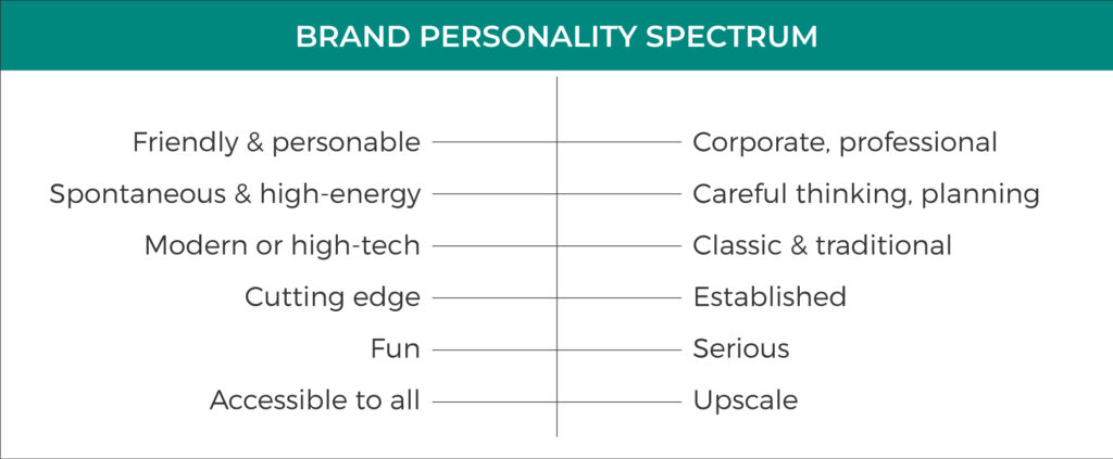
2. Identify your brand personality
To choose brand colours, you need to know what you’re trying to communicate. What is your vibe? How do you want your customers to feel about your brand? The aim is to help your customers to get to know your company and to form a positive impression of your brand as a whole. To do that, you need to define your brand personality. Have a look at the spectrum below, and note where your brand sits for each.
3. Create your brand colour palette
There are no hard and fast rules when it comes to choosing brand colours. Most brands have more than one colour; while the logo might be red, you may have pops of yellow and orange throughout your website and socials. This is known as a brand colour palette, and these colours need to play nice together. Here’s our formula for building a brand colour palette; use this as a framework to get you started on choosing your colours:
Start with 3 colours
Your base colour, a supplementary colour and a neutral. Brand colour palettes usually have 1-4 colours, but even a 1 colour brand will sometimes need colour variations for different applications and purposes; for instance you will generally require an inverted version of your logo for occasions where it appears on a dark background as opposed to a light background.
Base colour
On the brand personality spectrum, which personality trait is the most important to your brand? Your base colour should represent your brand personality’s formost trait. It must also attract your intended target audience.
Supplementary colour
Your supplementary colour will be the second most dominant colour. Choose a colour to convey another important brand personality trait. Keep in mind that the colour you choose must also complement your base colour, while of course still appealing to your target audience.
Choosing your neutral
Your neutral colour will generally be a background colour, something that allows the base and supplementary colours to shine. Typically a light colour; whites, greys, or beiges work well. You can also use black if that suits your brand, but it can be overpowering.
4. Create your brand guidelines
To keep your colours consistent, brand guidelines can be very helpful. Brand guidelines set the rules on the visual appearance of your brand. The more consistent your branding and colours, the more easily recognisable and remembered your brand is.
A key element of brand guidelines is documentation of your colour palette. It should show these visually, along with colour codes in CMYK, RGB and HEX codes. Include PMS colours if how your colours appear in print is super important.
Where to from here?
There’s so much more to colour theory than meets the eye. When choosing the right colours for your brand, delving a little deeper into colour theory can really take things to the next level. When you use colours consistently in your branding, you strengthen your brand’s association with those colours, and in turn strengthen overall brand awareness.
If you really want to capitalise on the power of colour in your branding and marketing, it may be worth talking to a professional design agency like Evolution. We can design all your branding assets, including a logo and brand guidelines; a user-friendly, SEO optimised website; or a targeted social media and email marketing campaign.
Give us a call to talk about evolving your business on 03 5222 3328 or send us an email at hello@evolutiondesign.com.au to organise a meeting to discuss your next move.
Written by: Rosie Lorimer / Inspired by: canva.com / Image credits: Unsplash
If you want to receive monthly emails from the Evolution team with our latest blog post, hot off the press, please sign up here.
